Imagine if you could deliver a KPI dashboard so appealing and easy to navigate that your users will love it and actually use it.
Or even better:
What if you could follow some easy steps to achieve this… and repeat them for all your visualizations regardless of the dashboard software?
You’d probably be pumped to read about them.
Lucky for you, that’s exactly what I’m going to share with you in this post:
17 Insanely Actionable best practices for KPI dashboards that you can use to build your visualizations TODAY.
According to a study made by Sheffield University in the UK, people reject or don’t trust what they are looking based on the design instead of the content.
Click a section below to be taken right to one of the recommendations and dashboard examples.
Note: even though it is the most important piece and should be at the beginning, we will move the planning piece to the end of the list. We know many of you are just looking for visualizations tips but if you are not in a rush I would suggest to take a look at them just in case.
- Choose the right KPIs to display
- Spread your information by relevance
- Avoid clutter
- Make your dashboard interactive
- Make your dashboard actionable
- Provide narrative when possible
- Review if you need your legend and check options for locations
- Evaluate the impact of scaling and try using it
- Review if title is needed
- Eliminate an axis if possible
- Remove especial effects
- Use standard colors
- Review your text
- Choose the right visualizations for your information
- Planning: Know your audience
- Planning: Check how people will consume the information
- Evaluate your KPI dashboard and refine it
1. Choose the right KPIs to display
If you get really specific requirements, it is fairly easy to move forward. If you don’t have them, ask yourself one question.
What is the most important measure for this person/department/area? If this measure is consistently red this person or the responsible for the area might be in trouble.
Then evaluate which other KPIs or measures impact that one. Those drivers should probably be in your dashboards alongside the main one. If they go up or down the main one will change as well.
After that select the main categories that might affect those KPIs and include additional details (i.e. KPI by customer, by channel, etc).
That will give you the main content for your dashboard.

2. Spread your information by relevance
You might have heard about Fitts’s law or at least you have heard that people typically consume the information on a screen following a specific pattern.
There are a couple of suggestions (F-shaped, Z-shaped) but what’s important is that the placement and design of each element on the screen is key.
Imagine if you are driving your car how many seconds you need to take to see if your tank has gas or not. That’s the time you users should spend to get that main piece of information.
Make sure your users will get the main piece of information within the first 3 seconds. This is why the KPIs are so important for your dashboards. Make sure you have the main number right there with its performance result.
The second piece should be consumed in the next six seconds and the rest will depend on what the user thought of that.
If you need additional ideas check the Value Based Design post by Birst.

3. Avoid Clutter
We know it would be ideal to answer all of our users’ questions with just one screen, but that’s probably not possible, so don’t try it.
If you try to add everything to a single dashboard your user will stop using it at some point and go to specific sources for specific questions.
Let’s try to build something that is “usable” to start.
The recommendation here is to start by showcasing the main KPI for your audience at the top left and then add the driver type of KPIs going either to the right or below the main one so the users know at a glance how they are doing.
After that you can start using more dimensionality. Break down your KPIs to “Level 1” by adding some dimensions (i.e. by customer, by channel, by region, etc.).
If you need to provide additional breakdowns or complementary information and that results into splitting the visuals into more than one dashboard it won’t be the end of the world.
If you feel that you can make it happen but you are struggling, in the next sections we’ll make some changes to give you some more real state.

4. Make your dashboard interactive
Even if you can’t fit all into one screen, you can still give the users the ability to explore the information without leaving the dashboard.
Most charts should have options to filters and if you have tables, make sure the users can sort them. Analyzing which product is most profitable or which customers generate more expenses are things you users probably want to do on their own.
If you add filters, make sure those are applied to the right panels of information and that you display which filters are applied at any point in time.

5. Make your dashboard actionable
Besides filters and buttons, your users will typically appreciate if you present the information in a way they can really use to evaluate performance. After all that’s what a KPI dashboard is all about.
Try comparing the actual results with targets to provide more insight. Targets can be set up based on previous period’s results, predictive information, industry benchmark, etc.
You can use this approach with KPIs or complete charts with conditional formatting or reference lines.
It is not the same thing to show we had $100MM in revenue than show we achieved 50% of our revenue goal. The second option provides information about performance and the user knows something must be done because the target was missed.
We also recommend using standard calculations across your KPIs. We typically use these categories (Achievement, Reduction, Absolute, Deviation and Zero Target). Each KPI then is assigned to a category and the formula to measure performance will depend on that. This way it will be easier for users to understand the dashboards and they will spend more time analyzing performance than discussing the formulas behind the KPIs.

6. Provide narrative when possible
We love to think everything we put together is self-explanatory, but you need to think about a new employee or just somebody that hasn’t been part of the building process and doesn’t know what all the requirements were at the moment of creating the dashboard.
Many tools today provide tooltips which are a great way to tell a story with your dashboard.
If there are formulas or additional data manipulation involved, I would suggest adding an information or help icon that opens up a document with the calculations or any additional information that is relevant to what they are seeing on the screen.
If the tool you are using doesn’t offer the option to upload or embed a document, just use a link and use SharePoint or any other file sharing system like dropbox. Ask the information technology team for some options if you are not allow to use a file sharing system.

7. Review if you need your legend and check options for locations
Many tools provide different options to display your legend, you can choose from left or right, bottom or top or just hiding it all together.
Check if you have a way to include the names of the elements within the chart without making it too crowded (we know some customer names can be crazy long!). If they fit nicely you can try removing the legend to save some space.
If the names contained in the legend are too long, you probably want to show them at the bottom or top of the chart, that way they won’t take multiple lines.

8. Evaluate the impact of scaling and try using it
If your charts are showing numbers and those are fairly large (more than 4 or 5 digits) chances are your users are not looking at the decimal places. Try scaling the numbers to thousands or millions to facilitate reading the information.
Don’t go crazy and try to scale all the numbers using different scales. Try being consistent, especially if your users need to compare values within your dashboard.

9. Review if title is needed
Imagine this scenario within a dashboard. You have one panel with a chart that shows a trend line for you Revenue KPI. Within the chart the Axis reads Revenue, then the chart title reads Revenue and last but not least, the dashboard panel reads Revenue!
You might think this is not important, but it might take more real state than you realize. Just leave one of them and make sure you are consistent.

10. Eliminate an axis if possible
As with the title above, this is about saving space. If you can add the values within the chart, then no axis is needed. Even better, your users will have more precise information without having to hover over your chart.
This is especially functional when the dashboard will be printed out.

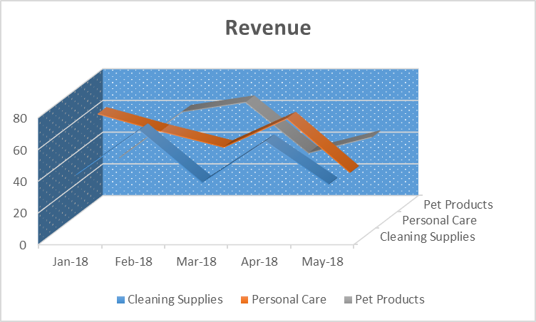
11. Remove especial effects
3D is great when you go to the movies and watch a Sci-Fi blockbuster, not so much when you want to provide specific information to business users.
This is not something critical, but if your line is thick or the tip of your bar covers half inch, then the users can be confused about what value they are looking at. This is even more important if you couldn’t include your values within your chart to eliminate the axis as we mentioned above (or just didn’t want to).
Check this nice article on Quora about when to use 3D charts.
Another special effect are the background colors and picture. Sometimes those will make your dashboard look great but they might be perceived as clutter by the users.
If you use a background color, make sure it’s not included in your palette or used in any of your labels. If this happens your text will disappear.
If you use an image, make sure the colors don’t impact your visualizations. I usually go for pictures that have a large area with the same color (i.e. a blue sky).
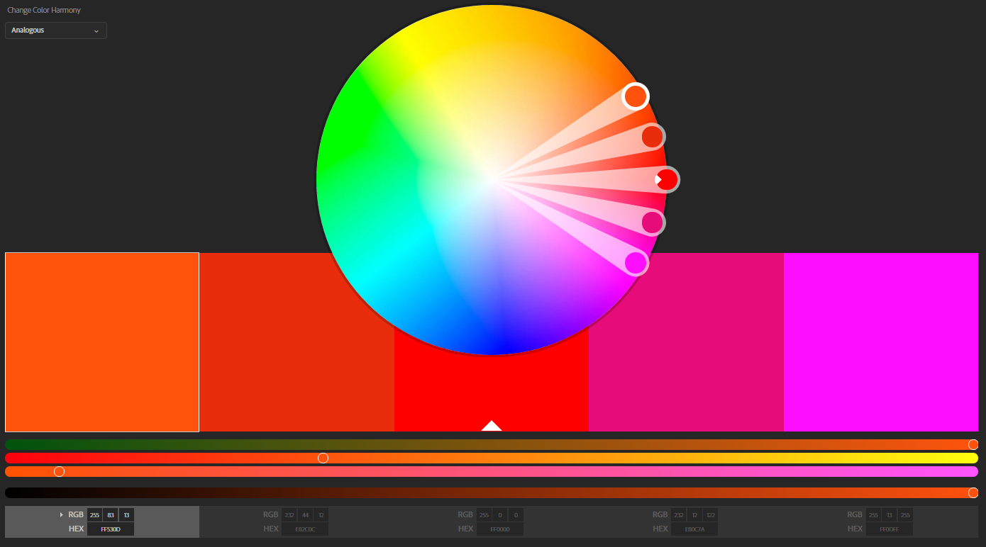
12. Use standard colors
If you are like me, one of the challenges is to find the right colors to mix and match.
Lucky for us, many applications now bring different default palettes we can use to make our dashboards look good.
Don’t use multiple palettes within the same dashboard, even if they look nice, we are looking to deliver value to our users, and not something they will hang on their leaving room (wouldn’t that be nice though?)
If the tool you are using doesn’t have that option, I would recommend using the Adobe palette website that can give you recommendations based on a main color.
Another option is to use the International Business Communication Standards (IBCS). These are a set of guidelines to facilitate the creation of charts, including colors.
13. Review your text
This is very straight forward. Make sure you use the same approach for all of your labels and texts. If You Want To Capitalize Your Title, then do it for all of them.
Also, if you call one chart Profitability Analysis, don’t name another one Analysis of Revenue. Not sure if I have made enough emphasis on this by now but consistency is key!
14. Choose the right visualizations for your information
Maps are great, but don’t try to use them for all your visualizations.
Make sure you choose the right chart for the right data. Here is a small summary.
Trend: this is one the basic and most used type. We want to show values over time. Line, bars and areas are probably the best way to show the information
Comparison: you want to measure different values against each other or against other data points. I would start with the same charts mentioned for trend and I would add horizontal bar charts, stacked bars, heat maps and three maps.
Distribution: you want to see how each piece or category contributed to your total. Typically pie/doughnut charts and waterfalls are great for this. I would add the Geo maps here as well to identify the distribution of your data over a specific territory.
Correlation: you want to compare behavior/impact of one element or category against another. Scatterplot and bubble charts are perfect for this.
For more detailed information you can check this guide from Tableau
https://www.tableau.com/sites/default/files/media/which_chart_v6_final_0.pdf

15. Planning: Know your audience
“I broke my back preparing this for them and they are not even using it”. If I had a dime….
If we give a CEO a dashboard that they need to filter, slice and dice and jump from one place to another, most probably won’t be used.
We need to evaluate who will use our dashboard, how much time they can spend on it, how they are going to access it, etc.
If we are talking about an analyst, they probably have more time and need to perform more actions on our dashboard. A C-level executive probably wants a KPI Dashboard where they can see how we are doing and contact the person accountable if they have questions.
Make sure you do this homework and your work will be much appreciated at the end.

16. Planning: Check how people will consume the information
If you make your dashboard highly interactive (filters, buttons, KPI drill downs, etc.) but your audience’s plan is to print it out, then most probably they won’t use it.
The thing would happen if they check the information on their cell phones but our charts are not responsive.
I know it is hard to know all the possible options, but we can get a lot of this information by checking in advance with our users.

17. Evaluate your KPI dashboard and refine it
Like in many other areas, after we deliver the requirements, we can keep track of the results and make adjustments accordingly. Many tools today offer KPIs to evaluate the usage of a specific dashboard.
You can check who is using it, for how long, what device/screen they used, etc. That way you can keep an eye on the deliverables and make sure what the users have is valuable.

I hope this post helps you in putting together the best KPI dashboards. Feel free to use them with Tableau, Excel, BusinessObjects, Birst, Power BI or any other dashboard software.
Do you have some more ideas you would add to the list? Do you have some dashboard examples you’d like to share?
We’d love to hear your thoughts, take a second and leave a comment.